|
We will explain group control.
When multiple control objects are selected, you can group them by right-clicking and selecting "Group" from the menu that appears. After grouping, the multiple objects can be treated as a single part.
Although a group control is visually invisible, it has properties, methods, and events just like a regular control.
By using these effectively, you can not only combine multiple controls, but also create libraries of parts with new user-specific functions, making your work more efficient.
Before grouping
|
After grouping
|
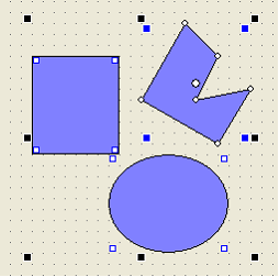
|
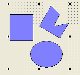
|

|
By making effective use of the grouping function and creating a new, unique collection of parts, you can streamline your work. It is convenient to create an xml file for the collection of parts, collect the parts you have created in one file, and then copy and use it when necessary.
|
|
When creating unique parts by grouping, make effective use of the custom property function. By using custom properties effectively, you can define the properties of multiple objects that make up a group together. For details, see "Common Properties (Custom Properties)".
|

|
Grouping can be canceled by the "Ungroup" operation. When this is done, all properties, scripts, and other settings applied to the group controls will be cleared.
If you accidentally ungroup something, you can restore it with UNDO.
|
 | Properties |
1) Positioning
Changing the Left/Top property of a group control will also move the child objects it is grouped with.
When grouped, the position of each object within the group will be relative to the top left coordinate of the group control, with (0,0) as the base point.
2) Size
If you change the Width/Height property of a group control, the child objects in the group will be scaled accordingly.
3) About FocusHover
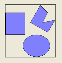
If you set FocusHover to TRUE for a form object and then set FocusHover to TRUE for a group control, a double square line will appear around the group control when you move the mouse over it, indicating that it can be focused, as shown below.
In this case, make sure that the Focusable property of each object in the group is FALSE.
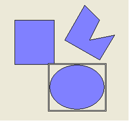
When the form object's FocusHover is set to TRUE, the group control's FocusHover is set to FALSE, and the Focusable property of each object in the group is set to TRUE,
Double lines will appear around each control, not around the group control.
This means that you can script individual mouse actions for each component.
|
| Method |
Like any other control, you can define user-defined functions for the Group Control, allowing the Group Control to have its own methods.
|
| Event |
Like any other control, a Group Control can handle events: A Group Control's OnMouseDown is called when any of the child objects in the Group receives a mouse click.
The same is true for OnMouseUp/OnMouseDblClick/OnMouseIn/OnMouseOut; when an event occurs from any child object, the corresponding event of the parent group control will also be called.
In this way, group control events can be used as events that represent each object in the group.
|
|