Image Select Switch
|
The image select switch is a component that writes the selected value (numeric value) by pressing a button to a tag. It supports value switching using three buttons, and the selector part is displayed as an image.
|
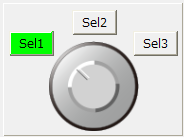
Specify the tag to be input as the input tag (_TagIn) and the tag to be output as the output tag (_TagOut). The value of the input tag will be the initial display, and thereafter the display will be dynamically updated whenever the value changes.
It is possible to specify the value of the input tag and each image file to be displayed corresponding to the input value in the properties. The input value does not necessarily have to be a sequential number, and can be set to any value.
In addition to the input tag, by specifying a tag for fault identification in the fault identification tag (_TagFault), it is also possible to display a fault based on signals such as equipment abnormalities received from downstream.
Custom Properties
Tag configuration |
Input Tags |
_TagIn |
Specify the tag path of the input tag. |
Output Tags |
_TagOut |
Specifies the tag path of the output tag. |
|
Fault Identification Tag |
_TagFault |
Specifies the tag path of the fault identification tag. |
|
Display settings |
ON color |
_LampOnColor |
Specifies the ON display color of the lamp. Used for parts that display the currently selected value as a button lamp. |
NULL color |
_LampNullColor |
Specifies the NULL display color of the lamp. The NULL color is the lamp display color when no value has been obtained from the input tag (for example, immediately after the screen is displayed) or when a fault occurs. |
|
Button selection color |
_BtnSelColor |
When the screen is displayed in a flat theme, specify the color of the button when it is selected. For parts with a Confirm button, it shows the selected state before confirmation (in the case of a 3D theme, it is shown by the bumps of the button, not the color of this property). |
|
Button 1 text color |
_Btn1TextColor |
Specify the label color for Button 1. By setting @AutoColor, the text color will be displayed in the most suitable color for the fill color. |
|
Button 2 text color |
_Btn2TextColor |
Specify the label color for Button 2. By setting @AutoColor, the text color will be displayed in the most appropriate color for the fill color. |
|
Button 3 text color |
_Btn3TextColor |
Specify the label color for Button 3. By setting @AutoColor, the text color will be displayed in the most appropriate color for the fill color. |
|
Background Panel |
_BackPanelColor |
Specifies the color of the background panel. |
|
Image 1 |
_SelectImage |
Specifies the image to display when the tag value is 1. The types of image files that can be handled are the same as those for the ImageLight control. |
|
Image 2 |
_SelectImage2 |
Specifies the image to display when the tag value is 2. |
|
Image 3 |
_SelectImage3 |
Specifies the image to display when the tag value is 3. |
|
Value Settings |
Tag Value 1 |
_SelectValue |
Specify the input tag value 1. It does not necessarily have to be a numeric sequence number, you can also specify a string. |
Tag Value 2 |
_SelectValue2 |
Specifies input tag value 2 (same as above). |
|
Tag Value 3 |
_SelectValue3 |
Specify input tag value 3 (same as above). |
|
Display character 1 |
_Label |
Specifies the display text for button 1. |
|
Display character 2 |
_Label2 |
Specifies the text to be displayed on button 2. |
|
Display character 3
|
_Label3 |
Specifies the text to be displayed on button 3. |
|
Input assistance settings |
Confirmation screen display |
_IsConfirm |
If enabled, a confirmation dialog will be displayed when performing an operation. |
Confirmation message |
_ConfirmMsg |
Specify the confirmation message to be displayed on the confirmation screen. |
|
Error Message |
_ErrorMsg |
Specifies the error message to be sent when a write error occurs. |
|
Operation history output |
_Log |
If enabled, the operation history will be output when a value is written. If you want to output the operation history in a standard project that uses the standard framework, enable the operation history setting from the system administration settings screen. For details, see "Operation History Settings". If you want to output the operation history in an original project that does not use the standard framework, define Alarm server to record the operation history and set the root DefaultFireAlarm property appropriately. |
|
Operation Message |
_LogMsg |
Specify the message to be output to the operation history. |
Usage Example
1) Select Switch
The selection state is identified by a single tag. The value of the input tag (_TagIn) is compared with tag value 1 (_SelectValue), tag value 2 (_SelectValue2), and tag value 3 (_SelectValue3), and the corresponding image is displayed in the selector.
_TagIn: Specify the tag path of the input tag
_TagOut: Specify the tag path of the output tag.
_TagFault...optional
|
The current selection is displayed. Clicking a selection button writes the value corresponding to the button to an output tag. Here, try clicking the "Sel2" button. |
|
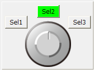
The value of Sel2 is written to the output tag and the status display frame changes to Sel2.
|
|
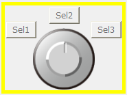
When the quality flag of the input tag is BAD or the fault identification tag is True, a fault is displayed. When a fault is displayed, a yellow frame will be displayed and flashing, and switch operation will be disabled.
|
|
If the same tag is used for both input and output, specify the same tag path for the input tag and output tag. |

|
By setting the "FocusHover" property of the form to which the component is attached to True, a focus frame will be displayed when you move the mouse cursor over the component to be operated. |
2) Confirmation screen display
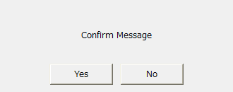
If you enable the confirmation screen display (_IsConfirm), a confirmation dialog (Yes/No) will be displayed when you perform a write operation.
|
If Yes is selected in the dialog, the value will be written to the tag.
|