|
The menu item property is a property of the item area of the side Menu control. For information about the item area, see "Layout". In addition, the menu item property is not set by the property of the control, but by the following method.
AddMenu / InsertMenu / SetMenuProperty / GetMenuProperty / SetIdProperty / GetIdProperty / SetClassProperty
Specify the property in the "Props" parameter of each of these methods using the following property setting format:
"Item property name: setting value"
|
You can also set multiple item properties at once by specifying them in an array.
c("Item property name 1:Setting value 1", "Item property name 2:Setting value 2" [, ...])
|

|
Below is an example of setting menu item properties.
Setting example) For AddMenu
Setting one property
this.AddMenu( "root" ,
"string" ,
"Sample" ,
"_SAMPLE" ,
F ,
"enable" ,
"id:sampleid");
|
Setting multiple properties
this.AddMenu( "root" ,
"string" ,
"Sample" ,
"_SAMPLE" ,
F ,
"enable" ,
c("id:sampleid", "class:sampleclass" ) );
|
|
Item (menu item/popup item) properties
|
|
|
id
|
The id of the item.
|
class
|
The class of the item. Multiple classes can be set by separating them with commas.
|
style
|
Specify the style name of the item. The style name is specified in "AddStyle".This is index 0 in the style definition array.
|
CheckState
|
The checked state of the menu.
|
EnableState
|
The state of the menu item.
enable
|
The menu item is displayed normally.
|
disenable
|
Disables the menu item so that it cannot be selected; it is not dimmed.
|
gray
|
Disables a menu item so that it cannot be selected and is dimmed.
|
|
FillColor
|
The fill color of the menu item.
|
PopupMarkColor
|
For popup items, the color of the marks (e.g. >) that indicate the Open_/Close state.
|
PopupMarkOpen
|
The open/close mark that is displayed when the popup item is in the Open state.
NONE
|
No mark
|
LEFT
|
Leftward (>)
|
RIGHT
|
Rightward (<)
|
UP
|
Upward (∧)
|
DOWN
|
Downward (∨)
|
|
PopupMarkClose
|
The open/close mark that is displayed when the popup item is in the Closed state.
NONE
|
No mark
|
LEFT
|
Leftward (>)
|
RIGHT
|
Rightward (<)
|
UP
|
Upward (∧)
|
DOWN
|
Downward (∨)
|
|
ClickSelect
|
Allows the selection of an item when the mouse is clicked. If not specified, the value of the ClickSelect property of the control property will be used by default.
|
ClickEvent
|
Allows the item to generate an event when the mouse is clicked. If not specified, the value of the ClickEvent property of the control property will be used by default.
|
ClickToggleCheck
|
Allows toggling the CheckState of the item on mouse click. If not specified, the value of the ClickToggleCheck property of the control properties will be used by default.
|
ClickAction
|
Only valid for setting. Use this property if you want to set "ClickSelect", "ClickEvent", and "ClickToggleCheck" together.
The setting values are specified as 1 or 0 in the order of ClickSelect / ClickEvent / ClickToggleCheck.
Example: 011
In this example, it is the same as setting ClickSelect=F / ClickEvent=T / ClickToggleCheck=T
|
Event
|
The value passed as an argument to the OnMsg event when the mouse is clicked. The OnMsg event occurs only when the ClickEvent property is T.
|
Left
|
Left position coordinates (read only).
|
Top
|
Top position coordinate (read only).
|
Width
|
Width (read only).
|
Height
|
Height (read only).
|
|
Properties of each Division in an item (menu item/popup item)
The menu item properties for each Division ("Left Division", "Middle Division", "Right Division") will be prefixed with "L(Left)", "M(Middle)", or "R(Right)".
Example) In the case of DivType, LDivType / MDivType / RDivType will be the property name when actually set.
|
|
|
DivType
|
The type of content to display within the Division area.
NONE
|
Not displayed. The size of Div will be 0.
|
TEXT
|
String
|
BAR
|
Menu selection status display bar
|
IMAGE
|
image
|
CHECK
|
check
|
COUNTER
|
Number
|
HYPERLINK
|
Hyperlink
|
Property name when used: LDivType/MDivType/RDivType
|
DivSizeX
|
The width of the region.
Property name when used: LDivSizeX/MDivSizeX/RDivSizeX
|
DivSizeY
|
The height of the region.
Property name when used: LDivSizeY/MDivSizeY/RDivSizeY
|
DivPaddingX
|
The region's x-padding.
Property name when used: LDivPaddingX/MDivPaddingX/RDivPaddingX
|
DivPaddingY
|
The y padding of the region.
Property name when used: LDivPaddingY/MDivPaddingY/RDivPaddingY
|
DivAlignX
|
The x-position (alignment) of the displayed content.
LEFT
|
Draws content left-justified
|
CENTER
|
Draw content in the center
|
CENTERITEM
|
Draw content in the center of the item (ItemDiv)
|
RIGHT
|
Renders content right-justified
|
Property name when used: LDivAlignX/MDivAlignX/RDivAlignX
|
DivAlignY
|
The Y position (alignment) of the displayed content.
TOP
|
Draw content at the top
|
CENTER
|
Draw content in the center
|
BOTTOM
|
Draw content at the bottom
|
Property name when used: LDivAlignY/MDivAlignY/RDivAlignY
|
ClickSelect
|
Specify this if you want to control the mouse click action for each M/L/RDiv area. Property details are the same as "ClickSelect" for the entire item.
Property name when used: LClickSelect/MClickSelect/RClickSelect
|
ClickEvent
|
Specify this if you want to control mouse click actions for each M/L/RDiv area. Property details are the same as the "ClickEvent" property for the entire item.
Property name when used: LClickEvent/MClickEvent/RClickEvent
|
ClickToggleCheck
|
Specify this if you want to control mouse click actions for each M/L/RDiv area. Property details are the same as the "ClickToggleCheck" property for the entire item.
Property name when used: LClickToggleCheck/MClickToggleCheck/RClickToggleCheck
|
ClickAction
|
Specify this if you want to control the mouse click action for each M/L/RDiv area. Property details are the same as the "ClickAction" property for the entire item.
Property name when used: LClickAction/MClickAction/RClickAction
|
Event
|
Specify this if you want to control mouse click actions for each M/L/RDiv area. Property details are the same as for the "Event" property for the entire item.
Property name when used: LEvent/MEvent/REvent
|
The following properties can be set for each DivType content type.
|
|
|
|
|
Text
|
The character to be displayed.
Property name when used: LText/MText/RText
|
TextOn
|
When specified, depending on the state of CheckState, the display will automatically switch to the Text property when Off and to the TextOn property when On.
Property name when used: LTextOn/MTextOn/RTextOn
|
TextColor
|
The color of the text. If not specified, it defaults to the value of the TextColor property of the control properties.
Property name when used: LTextColor/MTextColor/RTextColor
|
TextColorOn
|
When specified, the display will automatically change to the TextColor property when Off and to the TextColorOn property when CheckState is set.do.
Property name when used: LTextColorOn/MTextColorOn/RTextColorOn
|
TextFont
|
Font size for displaying text.
LARGE
|
Use the font specified in the FontLarge property
|
MEDIUM
|
Use the font specified in the FontMedium property
|
SMALL
|
Use the font specified in the FontSmall property
|
Property name when used: LTextFont/MTextFont/RTextFont
|
Desc
|
Text The description that appears below the property string.
Property name when used: LDesc/MDesc/RDesc
|
DescFont
|
The description font size.
LARGE
|
Use the font specified in the FontLarge property
|
MEDIUM
|
Use the font specified in the FontMedium property
|
SMALL
|
Use the font specified in the FontSmall property
|
Property name when used: LDescFont/MDescFont/RDescFont
|
TextNoWrap
|
Whether to wrap text (default is FALSE. However, the default is TRUE for the Mdiv of the page title only). If you set TRUE, if there are too many characters in the text to display, the text will not automatically break and will be displayed as "XXX...". If you set FALSE, the text will automatically break and be displayed.
|
|
|
|
|
|
BarColor
|
The color of the bar when CheckState is OFF.
Property name when used: LBarColor/MBarColor/RBarColor
|
BarColorOn
|
The color of the bar when CheckState is ON.
Property name when used: LBarColorOn/MBarColorOn/RBarColorOn
|
|
|
|
|
|
Text
|
The character to be displayed.
Property name when used: LText/MText/RText
|
TextOn
|
When specified, depending on the state of CheckState, the display will automatically switch to the Text property when Off and to the TextOn property when On.
Property name when used: LTextOn/MTextOn/RTextOn
|
TextColor
|
The color of the text. If not specified, it defaults to the value of the TextColor property of the control properties.
Property name when used: LTextColor/MTextColor/RTextColor
|
TextColorOn
|
When specified, the display will automatically change to the TextColor property when Off and to the TextColorOn property when CheckState is set.do.
Property name when used: LTextColorOn/MTextColorOn/RTextColorOn
|
TextFont
|
Font size for displaying text.
LARGE
|
Use the font specified in the FontLarge property
|
MEDIUM
|
Use the font specified in the FontMedium property
|
SMALL
|
Use the font specified in the FontSmall property
|
Property name when used: LTextFont/MTextFont/RTextFont
|
Desc
|
Text The description that appears below the property string.
Property name when used: LDesc/MDesc/RDesc
|
DescFont
|
The description font size.
LARGE
|
Use the font specified in the FontLarge property
|
MEDIUM
|
Use the font specified in the FontMedium property
|
SMALL
|
Use the font specified in the FontSmall property
|
Property name when used: LDescFont/MDescFont/RDescFont
|
Image
|
The path to the image file.
Property name when used: LImage/MImage/RImage
|
ImageOn
|
When specified, depending on the state of CheckState, the display will automatically switch to the Image property when Off and to the ImageOn property when On.
Property name when used: LImageOn/MImageOn/RImageOn
|
ImageColor
|
Set this when you want to change the color of the image.
Property name when used: LImageColor/MImageColor/RImageColor
|
ImageColorOn
|
Set this when you want to change the color of the image. When CheckState is Off, the display will change to the ImageColor property, and when it is On, the display will change to the ImageColorOn property.
Property name when used: LImageColorOn/MImageColorOn/RImageColorOn
|
ImageSizeX
|
Size of image and checkmark. If nothing is specified, it will be drawn with DivSizeX.
Property name when used: LImageSizeX/MImageSizeX/RImageSizeX
|
ImageSizeY
|
The size of the image or check mark drawn when DivType is IMAGE or CHECK. If nothing is specified, it will be drawn with DivSizeY.
Property name when used: LImageSizeY/MImageSizeY/RImageSizeY
|
ImageCircle
|
When TRUE, the image will be clipped to a circle (ellipse) when it is drawn.
Property name when used: LImageCircle/MImageCircle/RImageCircle
|
ImageCheckPos
|
Specifies the position to display a check mark if you want to display it on the image.
NONE
|
Do not display
|
CENTER
|
middle
|
LEFTTOP
|
Top left. In the image
|
RIGHTTOP
|
Top right. In the image
|
LEFTBOTTOM
|
Bottom left. In the image
|
RIGHTBOTTOM
|
Bottom right. In the image
|
LEFTTOP2
|
Top left. Outside the image
|
RIGHTTOP2
|
Top right. Outside the image
|
LEFTBOTTOM2
|
Bottom left. Outside the image
|
RIGHTBOTTOM2
|
Bottom right. Outside the image
|
Property name when used: LImageCheckPos/MImageCheckPos/RImageCheckPos
|
ImageTextPos
|
Specify this if you want to display text (Text property) or a description (Desc property) below the image.
NONE
|
Do not display
|
BOTTOM
|
Show Text
|
BOTTOM2
|
Display text. Long strings are automatically truncated.
|
BOTTOM_DESC
|
Shows text and description.
|
BOTTOM_DESC2
|
Display text and description, long strings are automatically truncated
|
Property name when used: LImageTextPos/MImageTextPos/RImageTextPos
|
ImageSwitchingType
|
Specify this if you want to switch the icon image (Image property/ImageOn property) depending on the ON/OFF state.
CHECKSTATE
|
Switch icon image depending on CheckState ON/OFF state
|
POPUPOPEN
|
For popup items, the icon image changes depending on the Open/Close state.
|
Property name when used: LImageSwitchingType/MImageSwitchingType/RImageSwitchingType
|
SelectImageColor
|
The color of the image when the menu item is selected.
Property name when used: LSelectImageColor/MSelectImageColor/RSelectImageColor
|
TitleTextPos
|
The position to display the Text as a title.
NONE
|
Do not display
|
LEFTTOP
|
Top left
|
RIGHTTOP
|
Top right
|
LEFTBOTTOM
|
lower left
|
RIGHTBOTTOM
|
Bottom right
|
|
TitleDescPos
|
Position to display Desc as title.
NONE
|
Do not display
|
LEFTTOP
|
Top left
|
RIGHTTOP
|
Top right
|
LEFTBOTTOM
|
lower left
|
RIGHTBOTTOM
|
Bottom right
|
|
|
|
|
|
|
ImageSizeX
|
Size of image and checkmark. If nothing is specified, it will be drawn with DivSizeX.
Property name when used: LImageSizeX/MImageSizeX/RImageSizeX
|
ImageSizeY
|
The size of the image or check mark drawn when DivType is IMAGE or CHECK. If nothing is specified, it will be drawn with DivSizeY.
Property name when used: LImageSizeY/MImageSizeY/RImageSizeY
|
CheckMarkType
|
The type of checkmark to display.
NONE,CHECK,LARGECHECK,RECTCHECK,RECTCHECK2,CIRCLECHECK,CIRCLECHECK2,RECTLAMP,RECTLAMP2,CIRCLELAMP,CIRCLELAMP2,CROSS,LARGECROSS
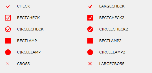
Property name when used: LCheckMarkType/MCheckMarkType/RCheckMarkType
|
MarkColor
|
Color of the checkmark. If not specified, it defaults to the value of the root MarkColor property.
Property name when used: LMarkColor/MMarkColor/RMarkColor
|
MarkColorOn
|
When specified, depending on the state of CheckState, the display will automatically switch to the MarkColor property when Off and to the MarkColorOn property when On.
Property name when used: LMarkColorOn/MMarkColorOn/RMarkColorOn
|
MarkBackColor
|
Background color of the checkmark. If nothing is specified, the background will not be filled.
Property name when used: LMarkBackColor/MMarkBackColor/RMarkBackColor
|
|
|
|
|
|
Text
|
The character to be displayed.
Property name when used: LText/MText/RText
|
TextOn
|
When specified, depending on the state of CheckState, the display will automatically switch to the Text property when Off and to the TextOn property when On.
Property name when used: LTextOn/MTextOn/RTextOn
|
TextColor
|
The color of the text. If not specified, it defaults to the value of the TextColor property of the control properties.
Property name when used: LTextColor/MTextColor/RTextColor
|
TextColorOn
|
When specified, the display will automatically change to the TextColor property when Off and to the TextColorOn property when CheckState is set.do.
Property name when used: LTextColorOn/MTextColorOn/RTextColorOn
|
TextFont
|
Font size for displaying text.
LARGE
|
Use the font specified in the FontLarge property
|
MEDIUM
|
Use the font specified in the FontMedium property
|
SMALL
|
Use the font specified in the FontSmall property
|
Property name when used: LTextFont/MTextFont/RTextFont
|
|
|
|
|
|
Text
|
The character to be displayed.
Property name when used: LText/MText/RText
|
TextOn
|
When specified, depending on the state of CheckState, the display will automatically switch to the Text property when Off and to the TextOn property when On.
Property name when used: LTextOn/MTextOn/RTextOn
|
TextColor
|
The color of the text. If not specified, it defaults to the value of the TextColor property of the control properties.
Property name when used: LTextColor/MTextColor/RTextColor
|
TextColorOn
|
When specified, the display will automatically change to the TextColor property when Off and to the TextColorOn property when CheckState is set.do.
Property name when used: LTextColorOn/MTextColorOn/RTextColorOn
|
TextFont
|
Font size for displaying text.
LARGE
|
Use the font specified in the FontLarge property
|
MEDIUM
|
Use the font specified in the FontMedium property
|
SMALL
|
Use the font specified in the FontSmall property
|
Property name when used: LTextFont/MTextFont/RTextFont
|
Desc
|
Text The description that appears below the property string.
Property name when used: LDesc/MDesc/RDesc
|
DescFont
|
The description font size.
LARGE
|
Use the font specified in the FontLarge property
|
MEDIUM
|
Use the font specified in the FontMedium property
|
SMALL
|
Use the font specified in the FontSmall property
|
Property name when used: LDescFont/MDescFont/RDescFont
|
TextNoWrap
|
Whether to wrap text (default is FALSE. However, the default is TRUE for the Mdiv of the page title only). If you set TRUE, if there are too many characters in the text to display, the text will not automatically break and will be displayed as "XXX...". If you set FALSE, the text will automatically break and be displayed.
|
|
Popup Item Specific Properties
|
|
|
PopupId
|
The Id of the popup.
|
Open
|
Open or closed?
|
PopupType
|
The type of popup item. Default is "TREE".
TREE
|
Clicking it will toggle between Open and Close, and when open the child items will be displayed in a tree format.
|
PAGE
|
Clicking it toggles between Open and Close, and when open the child items are displayed in page format.
|
OUTER
|
Clicking it will toggle between Open and Close, and when open the child items will pop up on the outer right or left.
|
|
NewLine
|
If multiple columns are displayed using the Cols property, whether to start a new line for each popup. The default is TRUE.
|
ToggleOpen
|
Allow toggling popup open state on mouse click. Default is TRUE.
|
PopupOuterWidth
|
If you set this property to a value greater than 0, it specifies the width of the outer popup portion when PopupType is OUTER.
|
|
|
|
|
|
PageFillColor
|
Background color of page title.
|
PageLTextFont
|
Font for the left text of the page title.
|
PageLTextColor
|
The color of the text to the left of the page title.
|
PageMTextFont
|
Font of centered text of page title.
|
PageMTextColor
|
Page title center text color.
|
|
|