Introduction to creating screens using standard controls
This section provides a simple explanation of the steps to create a screen using standard controls.
We will introduce the steps to create a simple screen like the one below using labels, edit boxes, rectangles, and Button control.
(Screen image)
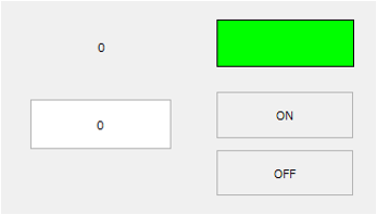
|
For details on how to use Panel Editor, see "Editing operations with Panel Editor". For details on how to edit controls, see "Basic control editing methods". |

|
Detailed specifications for each control are described in "Control Reference". |
■ Creation procedure
The following steps assume that the following tags are registered in Panel Server.
•U01.F01.D0000 - Numeric tag
•U01.F01.M0000 ... bit tag
1.Add a label to the form
From the control view displayed to the right of Panel Editor, select Basic > Label.
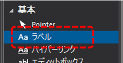
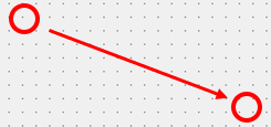
Anywhere on the form, drag the mouse from the upper left to the lower right of the area where you want to paste the control to specify the area.
The label was attached.
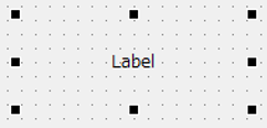
Furthermore, controls and parts attached to the screen are called "objects." In the following explanations, for example, a pasted label will be referred to as a label object, Label control object, or simply as a "label."
2.Set the label
When you double-click the label you have pasted onto the form, the properties dialog box will appear.
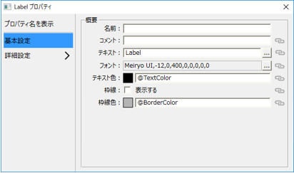
Click the link icon to the right of "Text" in the dialog.

The following dialog will then be displayed:
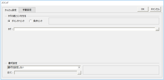
In the "Tag" input box in the dialog, enter the tag path "U01.F01.D0000" and click OK.
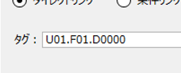
This setting binds the U01.F01.D0000 tag to the label's text (the Text property).
3.Paste the edit box
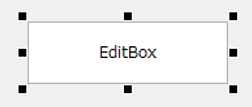
In the same way as with labels, select Basic > Edit Box from the Control View in the upper right-hand corner of the screen, and anywhere on the form, drag the mouse from the upper left to the lower right of the area where you want to paste the control to specify the range.
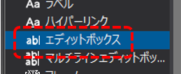
The edit box is attached.
4.Configure the edit box
Double-click the edit box to display the properties dialog.
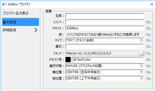
Select the "Type" combo box in the dialog and set it to "NUMBER".

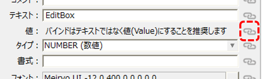
Then click the link icon to the right of "Value" in the dialog.
The following dialog will then be displayed:
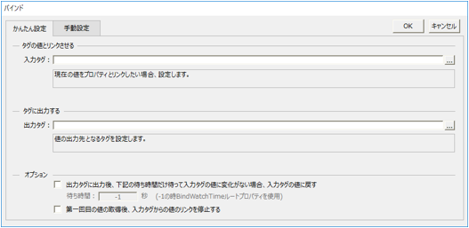
Enter the tag path "U01.F01.D0000" in the "Input Tag" input box of the dialog.
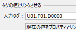
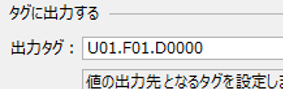
Similarly, enter the tag path "U01.F01.D0000" in the "Output Tag" input box in the dialog, and click OK.
5.Paste a rectangle
From the Controls view, select Shapes > Rectangle and place the rectangle anywhere on the form.
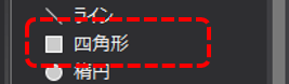
The rectangle is attached.
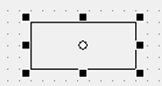
By setting this rectangle, we will create a lamp that changes color depending on the tag value.
6.Set the rectangle
When you double-click the rectangle pasted on the form, the following dialog box will be displayed.
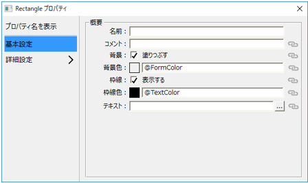
Click the link icon to the right of "Background Color" in the dialog.

The following dialog will then be displayed:
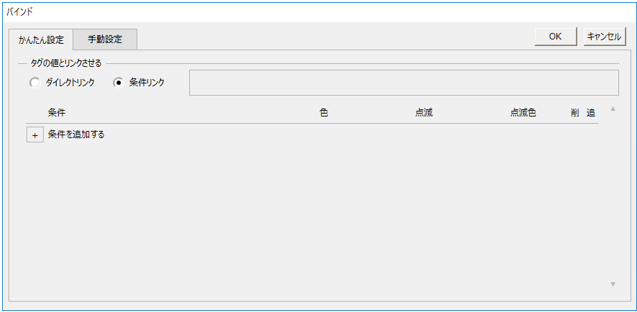
Click the "+" button twice under "Add condition" to add two lines of conditions.
Click the "..." selection button for the "If" condition in the first line to display the condition dialog.

In the input box of the condition dialog, enter the tag path "U01.F01.M0000" and click OK.
Next, click on the color of the condition in the first row.

A color selection dialog will appear, so select red and click OK.
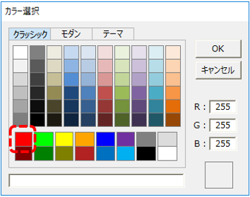
Next, click "..." in the second condition row.

Click "Other than the above" at the top of the condition dialog that appears.
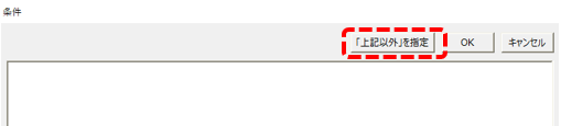
Next, specify the color for the second condition. Specify green in the same way as you specified the color for the first condition.

The conditions have been set. Click the OK button to close the setting screen.

7.Attach two buttons
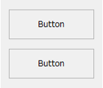
Next, attach two buttons to the form and make each button into a write button for the ON operation and OFF operation.
From the Controls view, select Basic > Button and paste it anywhere on the form.
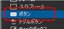
The button was attached.
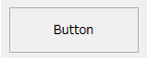
Paste another button in the same way (you can also copy the first button).
8.Set one button as the ON button
When you double-click the button on the form, the following dialog box will be displayed.
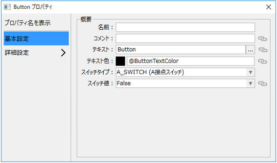
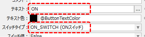
Edit the dialog's "Text" to "ON" and change the "Switch Type" to "ON_SWITCH".
Next, click the link icon to the right of "Switch Value" in the dialog.

The following dialog will then be displayed:
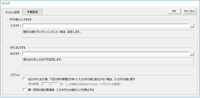
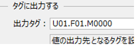
In the "Output tag" input box of the dialog, enter the tag path "U01.F01.M0000" and click OK.
9.Edit the ON button color
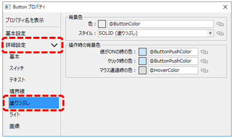
From the list on the left side of the dialog, open "Advanced Settings" and select "Fill".
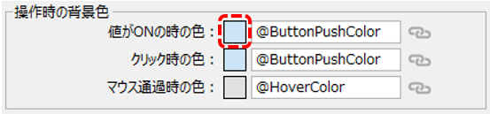
Among the setting items, click the color display (square) of "Color when value is ON."
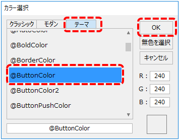
The following color selection dialog will then be displayed, so select the "Theme" tab, select "@ButtonColor" from the list, and click the OK button.
10.Set the other button as the OFF button
Double-click the other button to display the dialog, then change "Text" to "OFF" and "Switch Type" to "OFF_SWITCH".
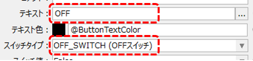
Next, click the link icon to the right of "Switch Value" in the dialog.

In the "Output tag" input box in the dialog that appears, enter the tag path "U01.F01.M0000" and click OK.
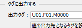
This completes the setup process.
11.Operation check
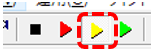
Click Panel Server Online (yellow arrow) to bring it online.
Next, click the Panel Editor browser run icon (green arrow) to bring Panel Browser online.
Once Panel Browser is launched, display the form you created above.
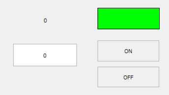
Enter a number (in this example, "15") in the edit box.
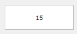
Then, the label display changed from 0 to 15.
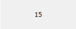
If you check the current value of the target tag on the Panel Server side, you can confirm that it has also changed to "15".
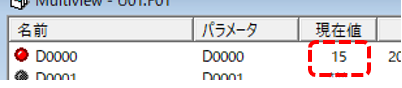
The above is the result of a series of processes: when the value in the edit box was changed, the value was written to the D0000 tag assigned to the output tag of the edit box, and because the same D0000 tag is also assigned to the input tag of the label text, the same value as that written is displayed on the label.
Next, check the operation of the lamp and the ON/OFF button.
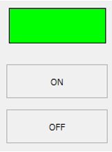
Currently the lamp is green.
|
Clicking the "ON" or "OFF" button will change the lamp color to red or green.
The flow of this operation is as follows: First, each time a button is clicked, the value of each switch (TRUE for the ON button, FALSE for the OFF button) is written to the M0000 tag assigned to the output tag of the switch value of each button.
And because the background color of the lamp display rectangle references the same M0000 tag as above as the input tag, the display color changes according to the change in the tag value written by button operation.
|
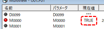
If you check the current value of the target tag on the Panel Server side, you can see that the value is written each time the button is operated and changes to "TRUE" or "FALSE".
In this way, you can use standard controls to display tag values and write values. You can also use the same technique to create animations by dynamically changing the display position and size of a part itself, for example by assigning a tag to the display position property of a control, or to switch the display/hide of the part itself depending on the tag value.