Download the sample
Here, we will explain the various binding settings in detail using examples.
This sample is available below.
|
This sample uses Browser tag. Browser tag is a tag used only by Panel Browser. For more information about Browser tag, see "Browser tag". |

Bit tag binding example
We will explain binding using bit tags.
1) Tag ON/OFF operation from toggle button (input/output)
Toggle button control changes the SwitchValue property between two values, TRUE/FALSE, each time the button is clicked.
In addition, when this property is TRUE, the button will be pressed, and when it is FALSE, the button will be raised, allowing you to represent the current value.
By configuring the following binding settings, you can turn tags on and off by operating buttons.
Properties |
Easy setting details |
Bind Expressions |
SwitchValue |
Input tag: $M0 Output Tag: $M0 |
INOUT:$M0 |
|
When $M0 is FALSE, the button is in the OFF state. |

|
When you click the button, $M0 is written to TRUE and the button's appearance changes. From then on, each time you click the button, the corresponding value (TRUE/FALSE) will be written. Also, when the value of $M0 changes, the button display will change accordingly. |

2) Tag ON/OFF operation using two buttons (output only)
Button control means that if SwitchType is "ON_SWITCH", clicking the button will output TRUE to SwitchValue.
Also, if SwitchType is "OFF_SWITCH", clicking the button will output FALSE to SwitchValue.
Therefore, by using two buttons and setting the following bind settings for each button, you can use the two buttons to turn the tag on/off.
ON button side* Set SwitchType to ON_SWITCH
Properties |
Easy setting details |
Bind Expressions |
SwitchValue |
Input tag: (blank) Output Tag: $M0 |
OUT:$M0 |
OFF Button side* Set SwitchType to OFF_SWITCH
Properties |
Easy setting details |
Bind Expressions |
SwitchValue |
Input tag: (blank) Output Tag: $M0 |
OUT:$M0 |
|
Clicking the ON button writes TRUE to $M0, and clicking the OFF button writes FALSE to $M0.
|

|
The switch types available for Button control are A_SWITCH, B_SWITCH, ON_SWITCH, OFF_SWITCH, and ALTERNATE_SWITCH. By specifying the appropriate switch type for the situation you want to use it in, you can use it as a variety of switch functions. For details, see "Button control" in the Control Reference. |
3) ON/OFF text display using labels
Label control displays the content set in the Text property (numbers, characters, etc.).
By configuring the following binding settings, you can switch the label display between "ON" and "OFF" depending on the tag value.
Properties |
Easy setting details |
Bind Expressions |
Text |
If $M0 then "ON" If other than the above, "OFF" |
B.In("",T,$M0,"ON","OFF")
|
|
When $M0 is FALSE, the label displays "OFF". |

|
When $M0 becomes TRUE, the label display changes to "ON."
|

|
When you paste Label control into a form, it will normally have no fill or border, but you can edit the properties to use it with a fill and border. |
4) ON/OFF text display and lighting color display using labels
When you set the Fill property to TRUE, Label control can display the fill color by specifying FillColor.
By setting the following bind settings, you can change the label display to "ON" or "OFF" depending on the tag value, and also switch the fill color.
Properties |
Easy setting details |
Bind Expressions |
Text |
If $M0 then "ON" If other than the above, "OFF" |
B.In("",T,$M0,"ON","OFF")
|
FillColor |
If $M0 then #FF0000 If other than the above, #FFFFFF |
B.In("",T,$M0,"#FF0000","#FFFFFF") |
|
When $M0 is FALSE, the label will be displayed as "OFF" and the fill color will be lit in white (#FFFFFF). |

|
When $M0 becomes TRUE, the label display will become "ON" and the fill color will turn red (#FF0000).
|

5) ON/OFF text display using labels, blinking color display
This is an example of expanding on example "4" so that the display blinks when the signal is ON.
To blink, define the blinking in the bind settings.
Properties |
Easy setting details |
Bind Expressions |
Text |
If $M0 then "ON" If other than the above, "OFF" |
B.In("",T,$M0,"ON","OFF")
|
FillColor |
If $M0 then #FF0000, blinking @FAST #800000 If other than the above, #FFFFFF |
B.In("",T, $M0,B.BF("@FAST","#FF0000","#800000"), "#FFFFFF" ) |
|
When $M0 is FALSE, the label will be displayed as "OFF" and the fill color will be lit in white (#FFFFFF). |
|
When $M0 becomes TRUE, the label display will turn "ON" and the fill color will change to flashing red (#FF0000/#800000) every 500 milliseconds.
|

|
The blinking cycles provided by the system (fast (@FAST), medium (@MEDIUM), slow (@SLOW)) can be freely customized. For details about the blinking cycle, see "About the blinking cycle". |
Numeric tag binding example
This section explains binding using numeric tags.
1)Editing values from the edit (input/output)
An edit control allows you to edit a value.
By configuring the following binding settings, you can edit tag values from the screen.
Properties |
Easy setting details |
Bind Expressions |
Value |
Input tag: $D0 Output Tag: $D0 |
INOUT:$D0 |
|
The initial display shows the initial value of $D0. |

|
When you edit a value, the value is written to $D0. |

2)Numerical values in labels
Label control displays the content set in the Text property (numbers, characters, etc.).
The following bind settings will display the tag value as a number. Here, the NL function is used to display it with one decimal place.
Properties |
Easy setting details |
Bind Expressions |
Text |
NL($D0,1) |
NL($D0,1) |
|
The value of $D0 is displayed numerically with one decimal place. |

|
The NL function has parameters other than the number of decimal places, and you can specify the format of the number format. For details, see "CNumToLocale(NL)" in the Control Reference. |
3)Displaying text on labels (numerical comparison)
Label control displays the content set in the Text property (numbers, characters, etc.).
By setting the following bind, the tag value's numeric value will be compared with the specified value, and the value will be converted to a string and displayed.
Properties |
Easy setting details |
Bind Expressions |
Text |
if $D0 >= 80 then "HIGH" if $D0 <= 20 then "LOW" If other than the above, "NORMAL" |
B.In("",T, $D0 >= 80,"HIGH", $D0 <= 20,"LOW", "NORMAL" ) |
|
When the value of $D0 is 80 or greater, "HIGH" is displayed. |

|
When the value of $D0 is 20 or less, "LOW" is displayed. |

|
Any other value will be displayed as "NORMAL". |

4)Label with numerical value and color indication
By setting the following bind settings, you can display the tag's numeric value in a label with one decimal place and change the fill color.
Properties |
Easy setting details |
Bind Expressions |
Text |
NL($D0,1) |
NL($D0,1) |
FillColor |
if $D0 <= 20 || $D0 >= 80 If so, #FF0000 If other than the above, #FFFFFF |
B.In("",T, $D0 <= 20 || $D0 >= 80,"#FF0000", "#FFFFFF" ) |
|
When $D0 is greater than 20 and less than 80, the fill color is solid white (#FFFFFF). |

|
If $D0 falls outside the above range, the fill color will turn solid red (#FF0000).
|

5)Numerical display and blinking color display on labels
By setting the following bind settings, you can display the tag's numeric value in a label with one decimal place and make it blink with a change of fill color.
Properties |
Easy setting details |
Bind Expressions |
Text |
NL($D0,1) |
NL($D0,1) |
FillColor |
if $D0 <= 20 || $D0 >= 80 #FF0000, Blinking @FAST #800000 If other than the above, #FFFFFF |
B.In("",T, $D0 <= 20 || $D0 >= 80,B.BF("@FAST","#FF0000","#800000"), "#FFFFFF" ) |
|
When $D0 is greater than 20 and less than 80, the fill color is solid white (#FFFFFF). |
|
If $D0 falls outside the above range, the fill color will change to flashing red (#FF0000/#800000) every 500 milliseconds.
|

|
The blinking cycles provided by the system (fast (@FAST), medium (@MEDIUM), slow (@SLOW)) can be freely customized. For details about the blinking cycle, see "About the blinking cycle". |
Disable editing when tag communication is abnormal
This section explains how to disable editing when communication with PLC is not possible or when connection to Panel Server is not possible.
1)Disable editing when communication is abnormal
You can disable a control by setting the Enabled property to FASLE.
By binding the edit control as follows, editing will be disabled when a communication error occurs.
Properties |
Easy setting details |
Bind Expressions |
Value |
Input tag: $D0 Output Tag: $D0 |
INOUT:$D0 |
Enabled |
IsQualityGood(U01.F01.T01) |
IsQualityGood(U01.F01.T01) |
IsQualityGood returns TRUE if communication with the specified tag is normal, and FALSE if communication is abnormal.
|
Communication with U01.F01.T01 is normal and editing is valid. |
|
If communication with U01.F01.T01 becomes abnormal, editing will be disabled and editing will not be possible. |

Switching between operation permission and non-permission according to authority level
This section explains how to enable or disable button operations depending on the permission level.
1)Disabling buttons by level value
Here, we will assume that a number representing the user authority level is stored in Browser tag"$D100", and that the level value has four levels, from 0 to 3.
You can dynamically switch the enabled/disabled state of a control by setting a binding for the Enabled property of a button, which enables or disables its operation depending on the level value, to TRUE/FASLE depending on the level value (in this case, the value of $D100).
Button1 button
Properties |
Easy setting details |
Bind Expressions |
Enabled |
$D100 >= 0 |
$D100 >= 0 |
Button2 Button
Properties |
Easy setting details |
Bind Expressions |
Enabled |
$D100 >= 1 |
$D100 >= 1 |
Button3 Button
Properties |
Easy setting details |
Bind Expressions |
Enabled |
$D100 >= 2 |
$D100 >= 2 |
Button 4 Buttons
Properties |
Easy setting details |
Bind Expressions |
Enabled |
$D100 >= 3 |
$D100 >= 3 |
|
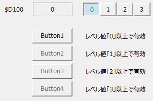
This is an example of running the sample.
In this example, the grouped toggle buttons at the top allow you to switch between level values. Clicking the toggle button changes the value of $D100 to 0, 1, 2, and 3.
When the value of $D100 changes, the target button is dynamically enabled or disabled.
|
|
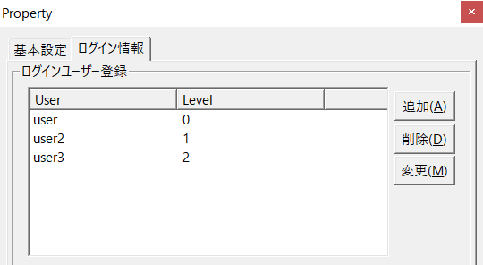
There are many cases where you want to set permission levels for users and change the operations that can be performed depending on the user level. You can build your own user permission management function using scripts, but you can also use the login function provided by Panel Server.
For example, if you define and register a login user and level on the Panel Server side as shown in the image above, the level value of a user who logs in to Panel Server from Panel Browser will be stored in the PSUserLevel root property. By writing a script that stores the value of this property in some Browser tag ("$D100" in the sample example) from the root "OnLogin()" event, or by setting up OUT binding to write to Browser tag, you can create a mechanism in each form that links the level value to the Enabled property of the target control as in the binding example in this sample, and switches the enablement of operations depending on the user level. |